Josh Wade

Programmer and Game Developer

Programmer and Game Developer
July 28, 2019
Welcome to the twilight of Project Canterbury. Let’s cover the last few features.
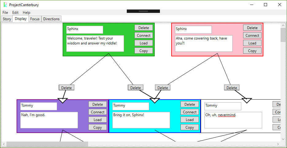
I’ve added some more feedback to the display section. Copied lines will be lit up as purple in their color hierarchy, and there are now arrows that indicate the flow of the conversation. This should help with some of the feedback I received that the display was a little confusing.
I filled out the help and about sections. These are simple but necessary, especially the controls segment. This should cut down on user confusion to some degree, though maybe these segments could use a bit more flesh on their bones. Additionally, the CYOA view can now select its starting root with a drop down menu instead of parsing an int from an entry text box, and the story name can be set separately from the file name.
But what's that in the center right? Could it be? Yes, rejoice and be glad, this project can finally send an email! All you need to do is fill out the prompts for the address, subject line, and body, and an outlook prompt will open right up with the .json form of the file attached. Given that this feature is something of a joke between my professor and me, I’m happy enough with it as it is.
Perforce integration is online – in that I can connect to a server – but that’s about it. I’ll need another hour or three to dig into the HPV and p4 libraries before I can actually check things in or out. I can have it done in time for the presentation at the end of all this.
Something that really ate me alive this week was getting a dark theme figured out. With a simple drop-down selection, one can change the view of Project Canterbury to something a little easier on the eyes. It was fairly easy to holistically change the colors of all the shapes and text – except for drop down boxes and scroll views, which I could not for the life of me parse out the style change syntax. It’s something to play with more later, I think.
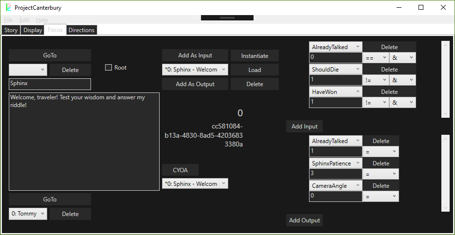
It was mostly bug fixes and tweaks on the tool side this week, testing edge cases and trying to catch null references. I ran into quite a few, but they're all knocked out now. The bulk of my time went toward hammering out this presentation. I’ve updated my sample game from before, and now it can switch between different camera angles, play sound effects, and trigger end game sequences all through the dialogue alone. I've written up a short story parodying the Riddle of the Sphinx to demo this all. This and the PowerPoint that accompanies it are crucial to demonstrating that I’ve made a tool that can play nice with game development.
I’m confident and proud that I’ve met my goals for this semester. Now there’s just the last legs of the home stretch. Thank you all for joining me on this developer quest.
July 21, 2019
This update, not unlike the current state of my project, is going to look a little smaller.
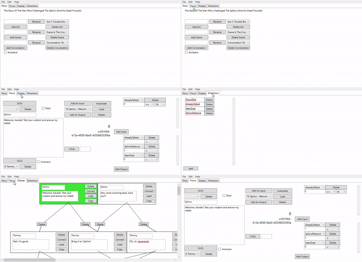
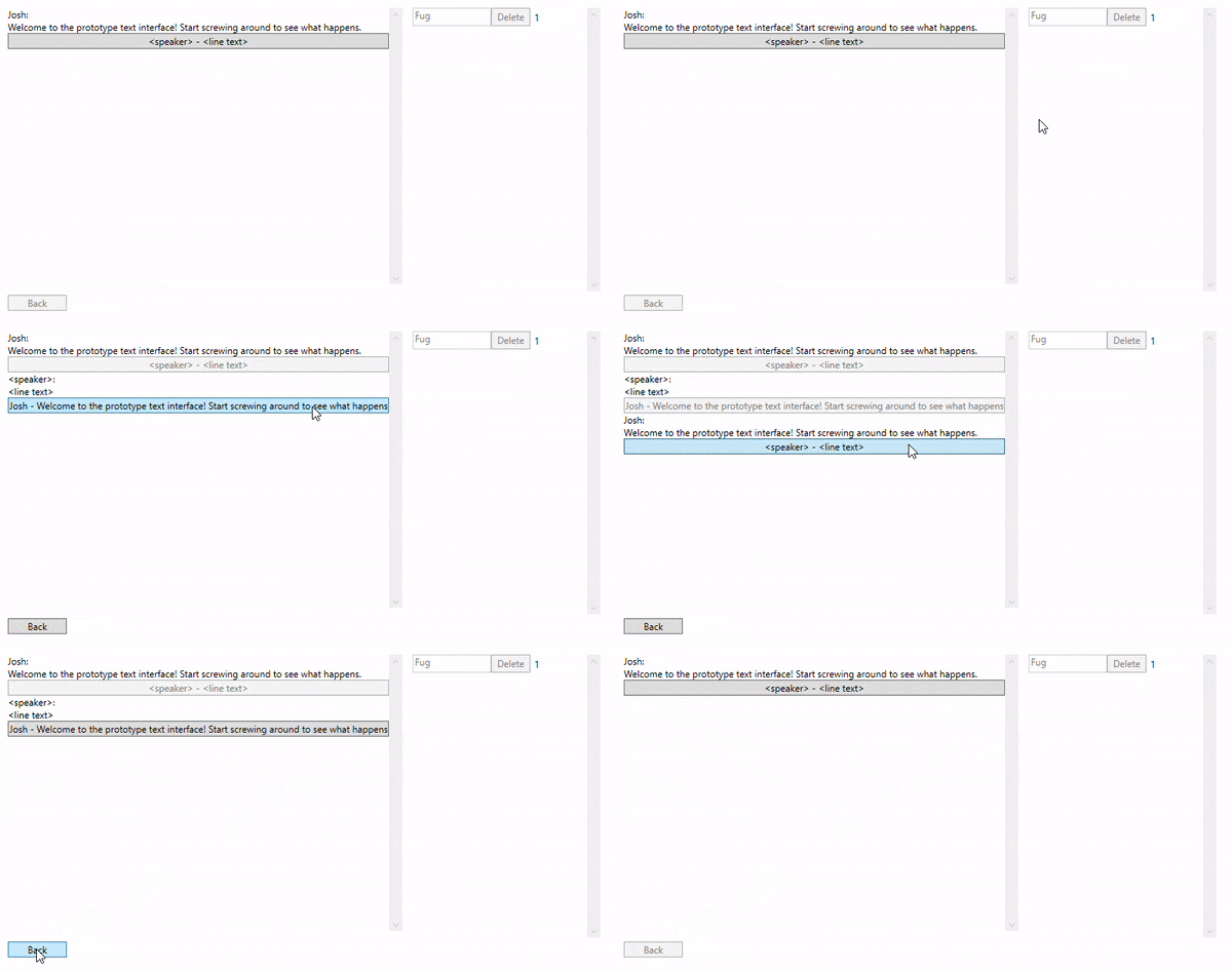
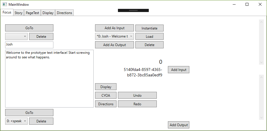
Surprise! All the elements of the editor are now in one window. No more window management, everything is right in one place. What was once the main window is now the "focus" view, which is handy as a way to see an individual element and less handy for writing an entire conversation. This design change is closely in line with the requests from the devs to change what the core experience of the dialogue writer is. Conveniently, it also makes things easier to demo with gifs on this site. For some elements, like the directions page, I feel this might be a lot of wasted space, but I don't think that can be helped.
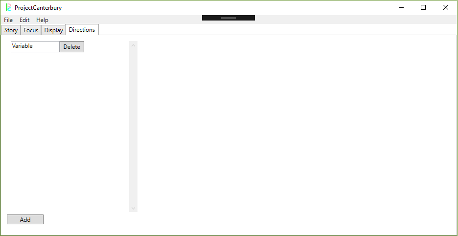
The exception to the all-in-tabs rule is the script view - renamed the "CYOA" view - which my design has always intended as a snapshot of the conversation in motion. This is mostly the same, but I've now added the directions as a sidebar so we can see those changes immediately and nearby. This has the added benefit of being decoupled from the "real" story in case its directions get renamed or changed. Additionally, you may have noticed a little box near the CYOA button - this allows the user to pick which root they want to start with. I can probably change this to a dropdown menu in a future update.
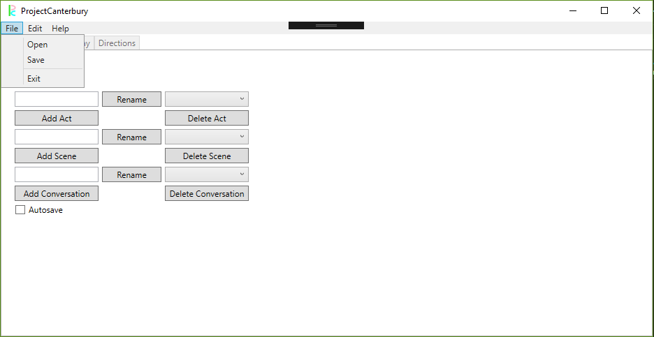
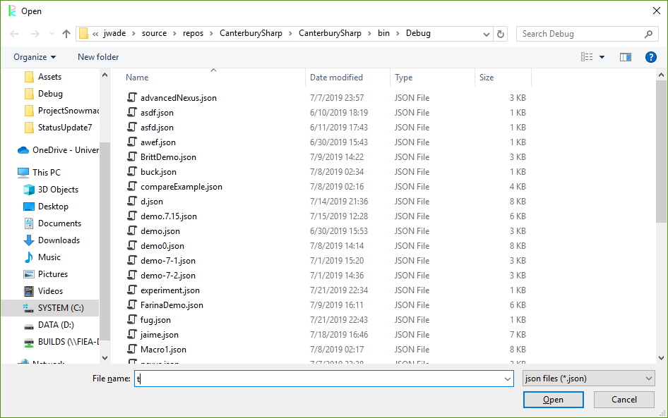
The nastiness of typing the name of the story into a text box is over, now we have actual windows forms for opening and saving stories. The autosave toggle is back, with a requirement to name the story first. These are launched with the file menu on the top tool bar, which also houses an edit menu for undo/redo. Naturally, these have now been hooked up to Ctrl-Z and Ctrl-Y.
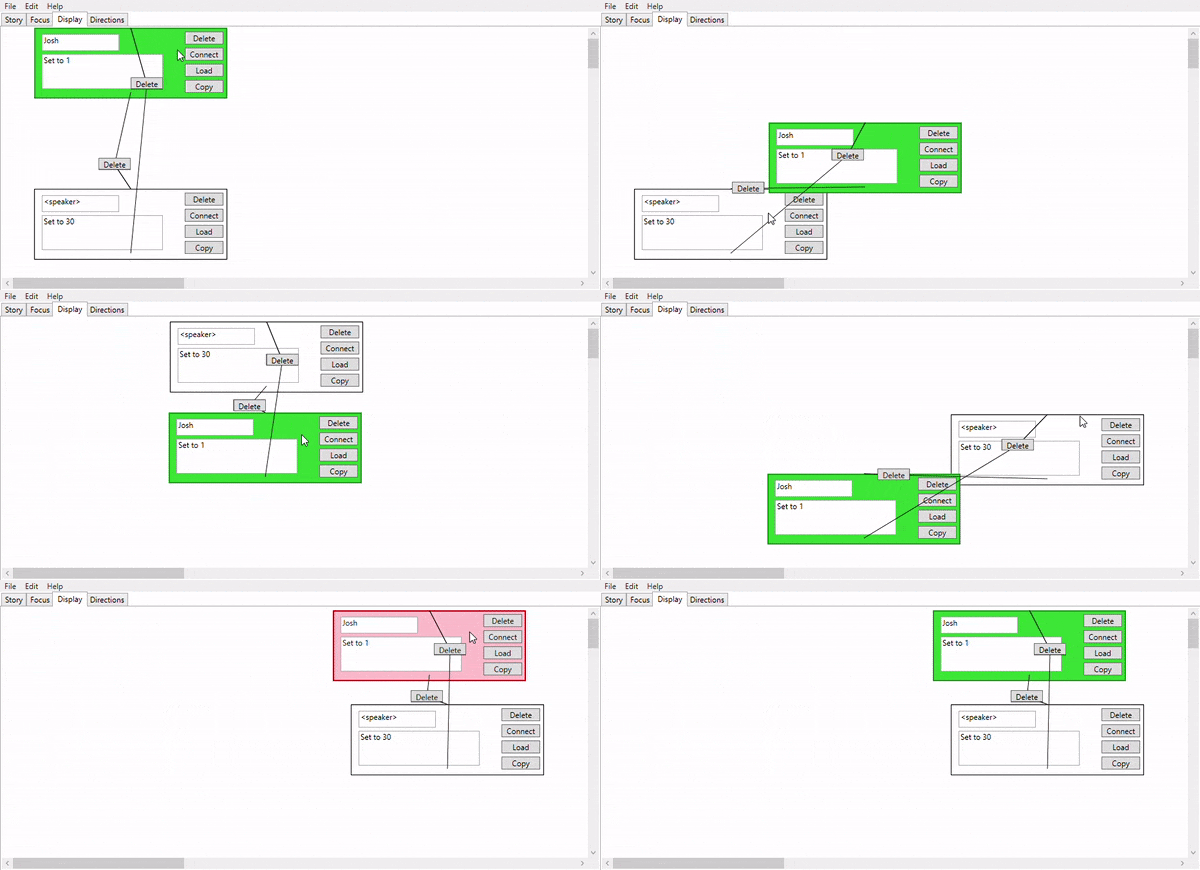
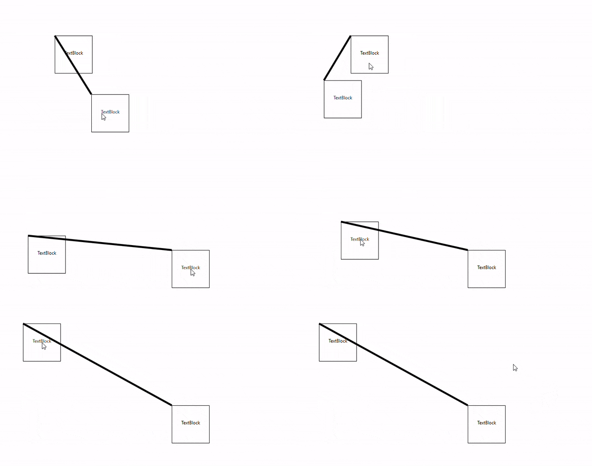
I made some slight rearrangements to how edges look in the display. Edges that lead from top to bottom have a slight left bias, and edges that lead from bottom to top lean right. Additionally, the output line is slightly thicker. These are meant to convey direction a little bit better, though I could tweak this quite a bit more if I wanted with curving lines and arrowheads. That may lead to diminishing marginal returns, though - line geometry can be a real pain to work with in WPF canvases.
Those are the big shakeups. Some smaller things are a little harder to show, such as the copy function now copying over the stage directions for the copied line, the ability to rename acts, scenes, and conversations, and the addition of spellcheck to the text boxes.
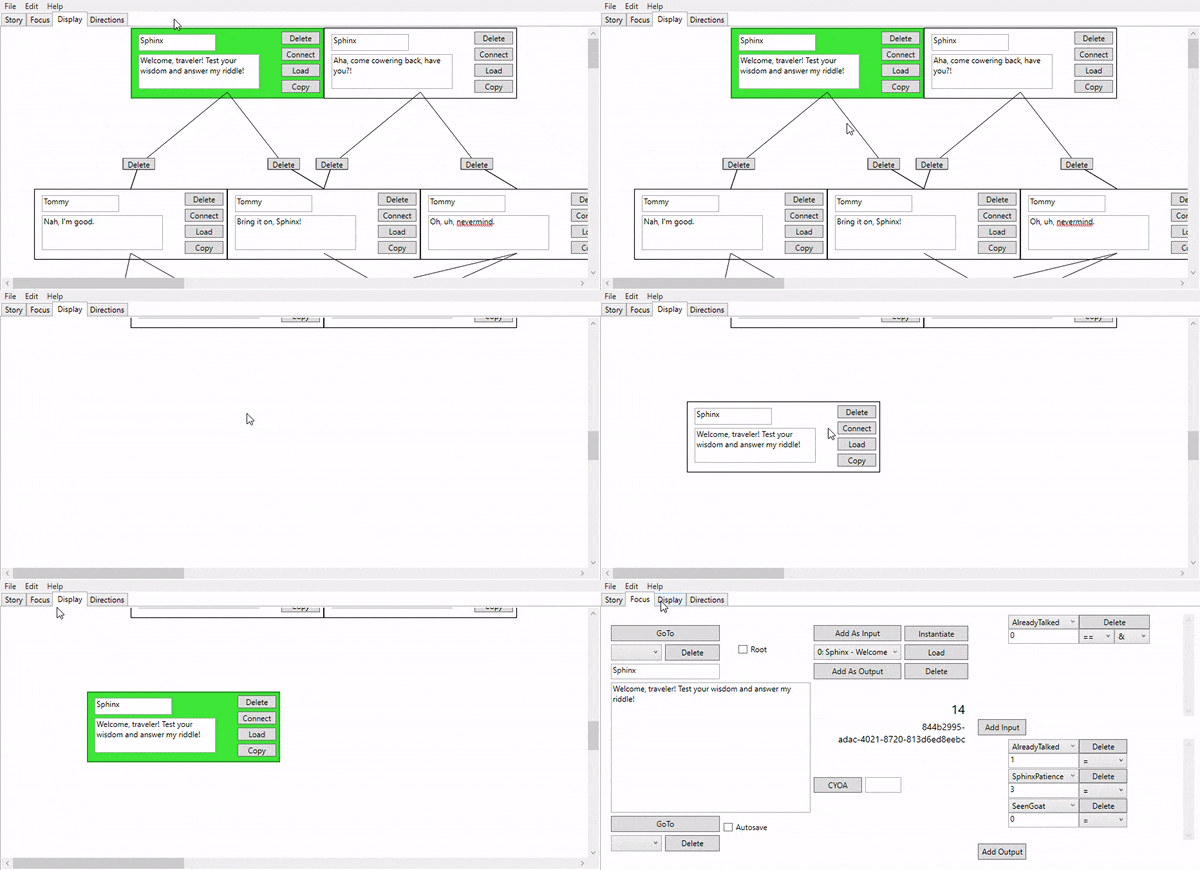
The final stages of this thing are just tweaking. Moving elements around in the display, checking for bugs and errors, testing for edge cases, and actually putting some content under the "help" section of the top bar. I might have a couple smaller features to play with, but for now, we're in the twilight of Project Canterbury. Perhaps I can implement the only true sign of a tool - whether it can send an email.
July 14, 2019
This is a pretty big update, so let's get straight to the biscuits.
I did a few more one on ones with the developers here at FIEA. It was crucial to me to get some of this feedback in before the semester ended. For my troubles, I got a great deal of feedback - some of it good, and a lot of it constructive.
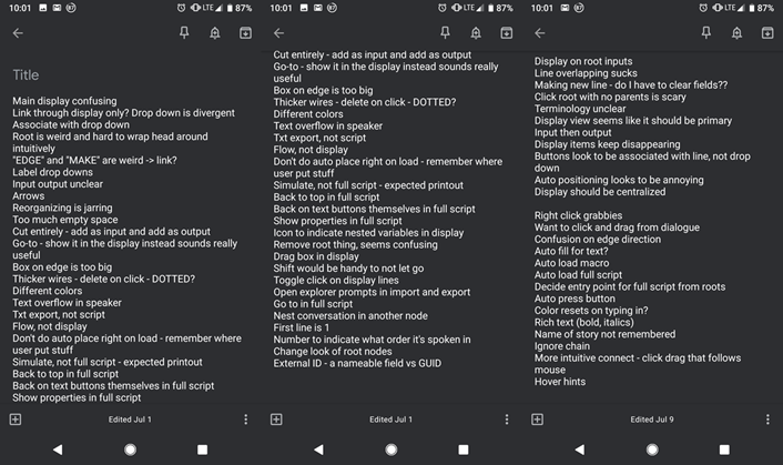
I got some of these changes in. I started tabbing out the controls to keep things in one window, with the eventual goal of both (eventually) not having a million windows open and centralizing the window display. I added more color to the display, moved and renamed the buttons, activated autoscroll the full script window, added some autoloading to the macro view, made it so stage directions update when playing through the conversation, and cleaned up some of the click/dragging. That said, I still have a lot of work to do to meet user expectations.
Zooming in/out was surprisingly easy. Scale transformations in the WPF canvas are natively supported, I just had to make scale adjustments in the click/drag functionality.
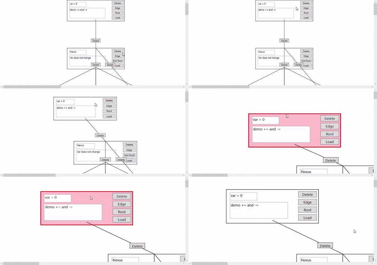
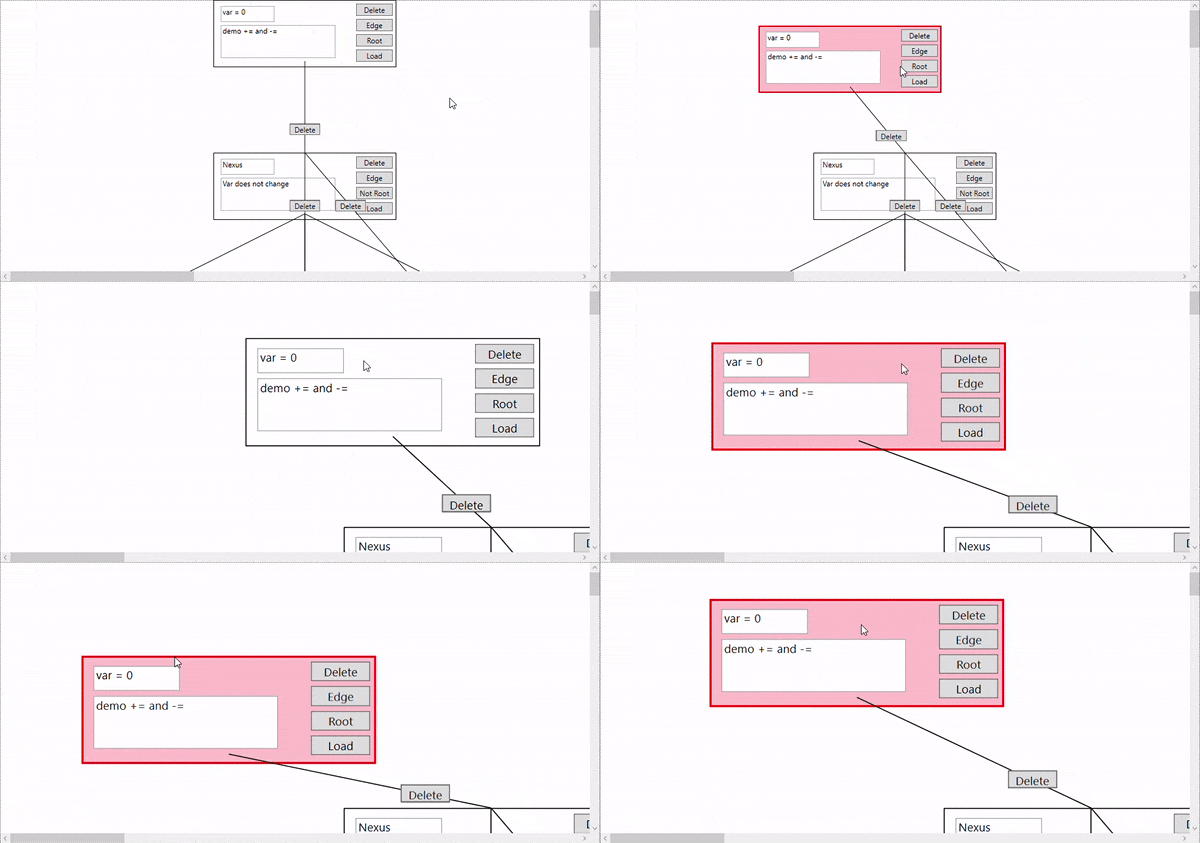
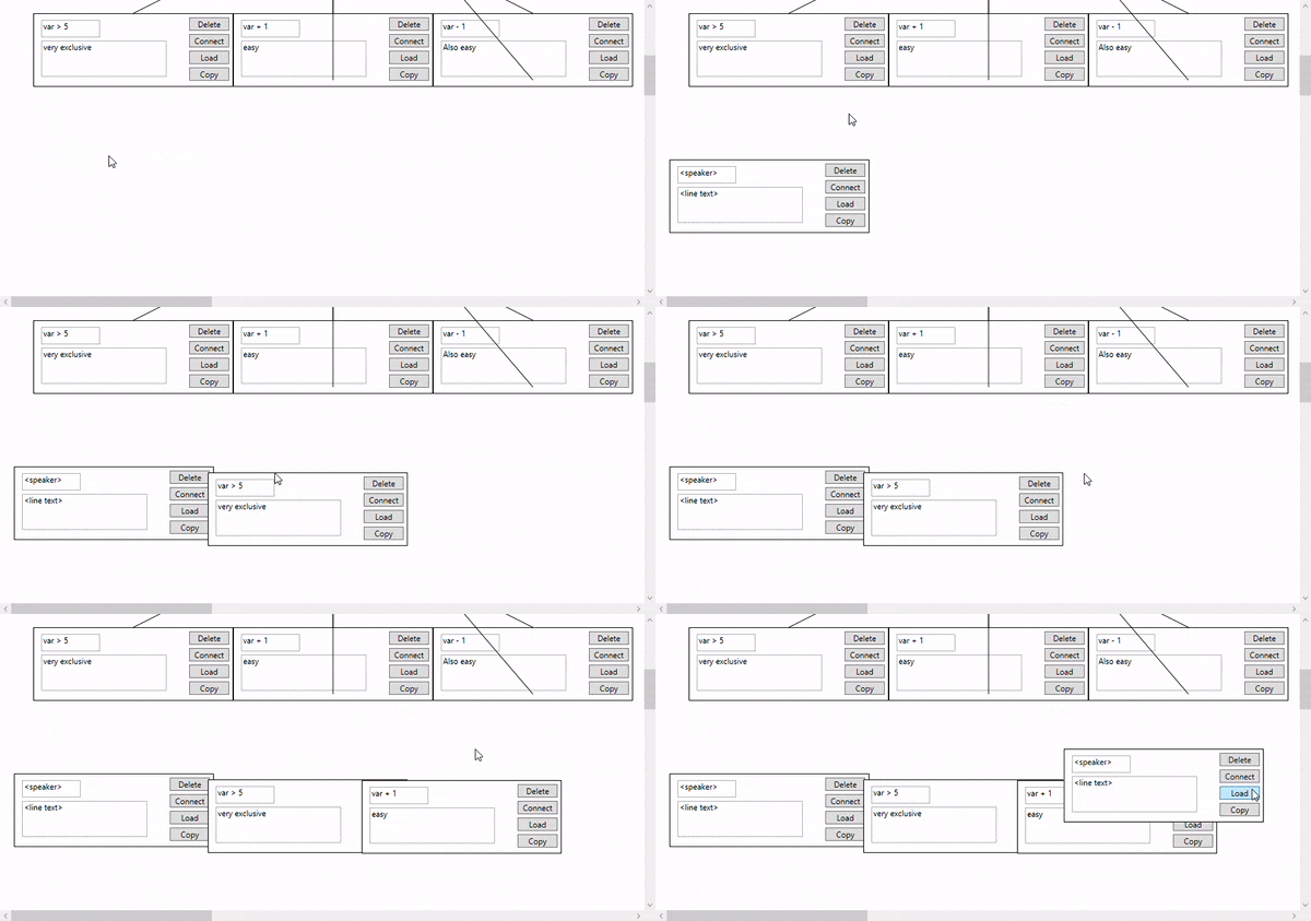
You can also copy/paste in the display now. By pressing copy on the line, that line will be stored in a buffer, copying over its information when a new bit of dialogue is made. Pressing C clears this buffer. I want to copy over stage directions and not just strings for dialogue and speaker, but that's just one copy constructor away from implementation. A little more difficult is whether the edges should be copied over as well - I'm not even sure if that's desirable for my users.
While not specifically tied to the Ctrl-Z and Ctrl-Y button presses, undo and redo are now in my system. These undos and redos are handled in a pair of stacks that pop off of and push on to each other, remembering changes to the structure of the conversation (adding a new line/edge, destroying an old line/edge, etc.). There's more I want to do with them - tying to keybindings, greying out the undo and redo options if these stacks are empty, and linking with textual changes in addition to structural, all of which are fairly easy additions. Additionally, this is a little bit nasty in its current implementation. I'm basically copying out the entire conversation and saving it off rather than just remember which command was applied. While I'd prefer the latter to the former, this would require a pretty comprehensive refactor of my system to the command pattern, and I'm not sure I have the time to implement that.
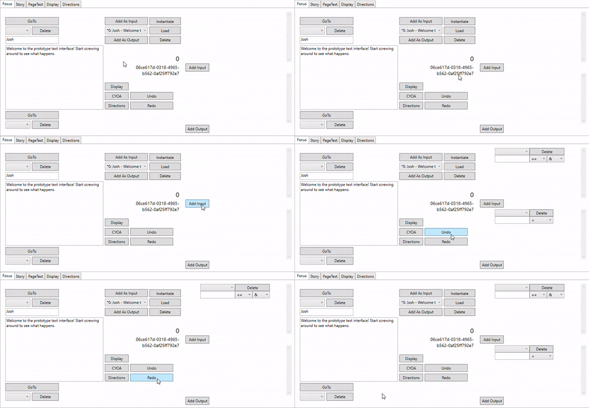
For stage directions, I added a string check for "contains" and "does not contain." I like the idea of really diverse options for logical checks. Maybe there are more logical options I haven't considered, but that's up to more developer one-on-ones.
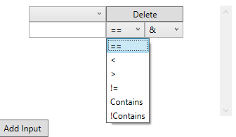
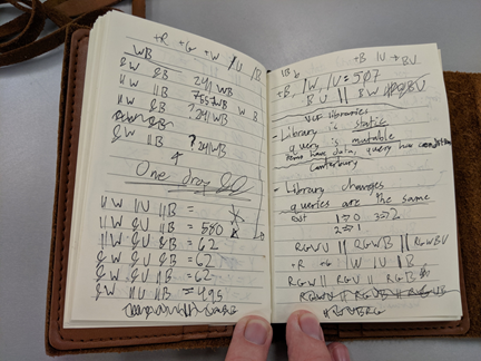
I also did some logical confirmation. The && and || system for logical operators in my system is closely tied to how university libraries and other databases (such as Magic: The Gathering's "Gatherer" website) handle searching. With a lot of notes and tests, I've arrived at a pretty close approximation for how they work. Basically, something passes a logical check in my system if all the &&s pass and none of the ||s fail.
I also cleaned up my serialization a little bit by removing some extra information that wasn't crucial or was included elsewhere. It's important for me to reduce redundancies in the output file. Part of it is that I want to have a small and efficient output file without unnecessary duplications across different parts, but truthfully, I've had some bad personal experiences with huge json files and I wouldn't wish parsing from articy upon my worst enemy.
Overall, I'm pretty happy with how far I've gotten in this system. My remaining work is basically just cleanup and presentation. Perforce integration would be really nice to see, as well as a help menu, opening files through a proper file menu rather than just typing in the file name in to some text box, and other quality of life changes.
July 7, 2019
Great strides forward this week. I think I’m really starting to get the hang of data bindings and passing data between windows.
The main task this week was stage directions, my tool for describing information about a conversation. It’s pretty straightforward, just name and value – this way, the user can track things with numerical value, like an emotional level, and things more fuzzy, like a string description.
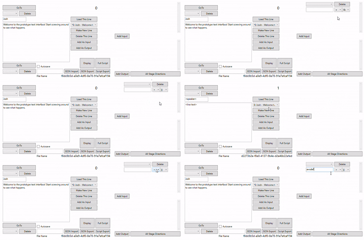
There are two ways to add directions to a line. Either it’s an input, which means it’s checking for some Boolean, or it’s an output, which means it’s just applying its value to the world state. Output assignment is easy enough – I even have options for += or -= in the case of numerics – but it was input checking that was really tricky. There’s the actual logic value (right now “==”, “!=”, “>” and “<”) as well as modifiers for “&&” vs “||”. The effects of these can be seen in the Full Script preview. In the future, I may want to add additional checks, such as “contains” or “does not contain.” I want full flexibility here. I might need to take a second pass on the logic itself first, however – I’ve drawn a lot of flow charts on how to handle an “Or” condition that fails with an “And” condition that passes.
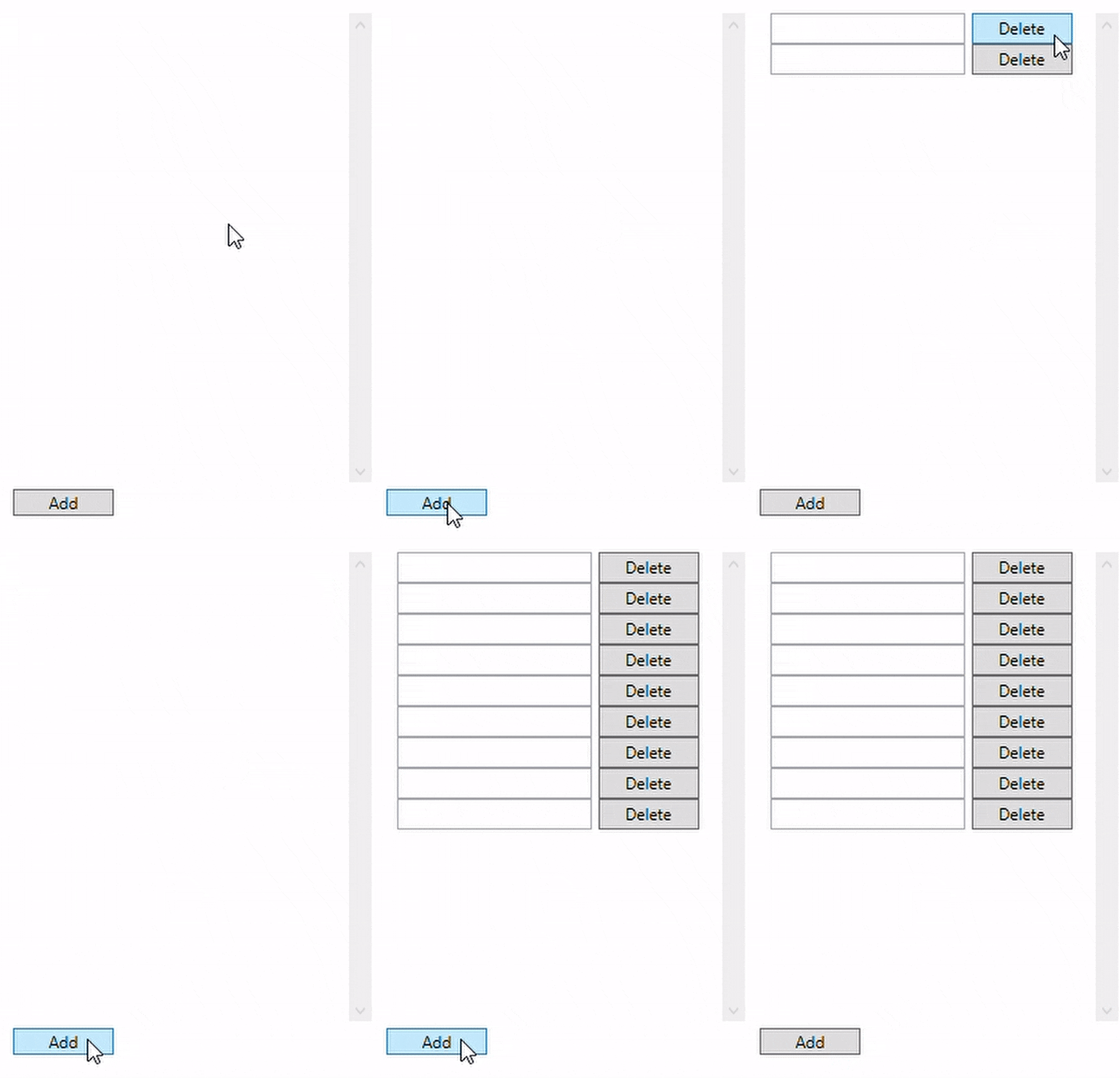
Stage directions are added to, selected from, and deleted from a master bank of stage direction strings. I agonized for a bit on how exactly to handle stage directions, how much each conversation point should know about each other one. I eventually decided that if one line knows about a stage direction, they all must be allowed that information. Some of the updating from this window seems slow, it appears I have to click around a bit to have changes take place. I think I may not have my notify property changed events properly hooked up, but perhaps I do, and any lag I’m encounter is more feature than bug. Something to explore in future weeks.
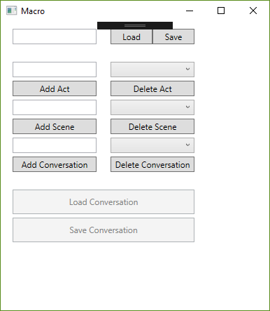
The rudimentary vocabulary I’ve decided on for storing this data on a macro level goes Story -> Act -> Scene -> Conversation -> Line. I intend to keep this a more rigid structure of the tool itself. Perhaps this is not truly or fully game-agnostic, but it seems perfectly reasonable as a way to structure a story from top to bottom. This view of top down is now what loads first when the project launches, the so-called “macro” window. This is a great advancement in treating this tool as a more broad interaction handler, and I’m pretty jazzed about continuing in that direction.
We’re one step closer to wrapping up this project, and there’s only so many advancements left. I finally got some feedback from a one-on-one with a writer here at FIEA, who had a lot of constructive advice for me. I look forward to parsing through his suggestions, hearing more suggestions, and bringing this thing in for the home stretch.
June 30, 2019
Another week has gone by, and I have had a lot of time to reflect on the questions from the previous two, as well as some feedback from my presentation. Here are the changes I've made.
First, I've redone my overall layout for the main display. This puts a little bit more emphasis on the easy of navigation and clarity of structure. Demonstrating the tool to multiple people, I've found there's some repeated confusions in how replies and lines interrelate with each other. Now, there is a bit more of the navigation taking up the real estate of the main display, not just the text of the lines. Additionally, there's the GUID of the line being displayed at the bottom for debug purposes.
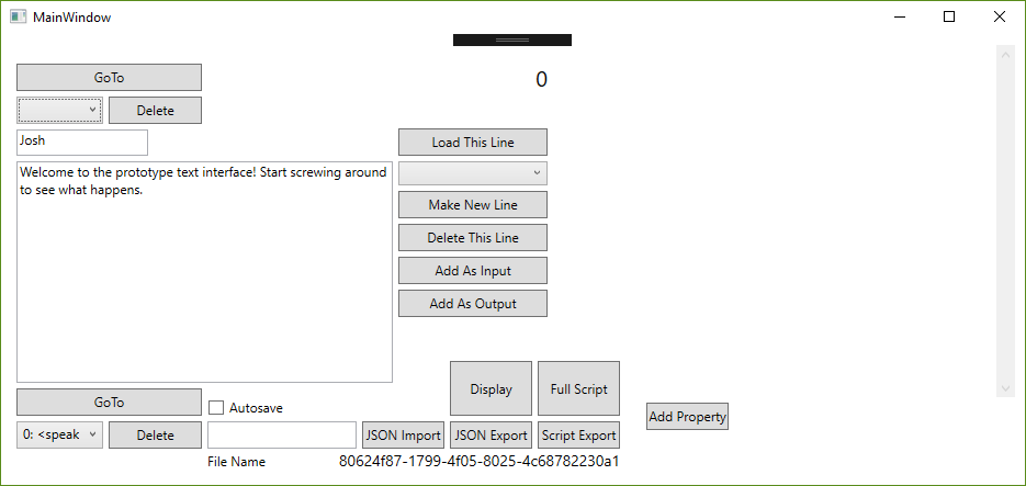
This brings me to my next change - I've cut the idea of replies as edges. I came to this idea that most conversations, even the ones in video games, aren't just line by line conversations between two people. Sometimes there's a string of lines one after another, bit by bit. Sometimes for extended periods of time, the player might not have any choice at all. Sometimes a choice is made not immediately by selecting a bit of dialogue but due to some other factor, perhaps decided earlier in the game by other factors. In any of these cases, and in others I'm sure I haven't conceived of, the idea of replies as direct player choice of dialogue didn't make much sense through the lens of game-agnostic dialogue writing. Cleaning up the awkward double-feature of reply and line editing from the main interface not only cleaned up over 300 lines of code, I'm certain it will make conveyance clearer to the users.
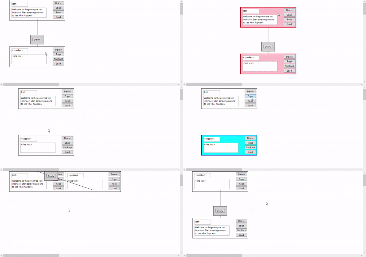
Speaking of clearer for users, there's a handful of new quality of life additions. The load button in the graphical display will take the desired line and load it into the main display for easier editing. There are new prompts to protect the user from accidentally overwriting old data - however, if the user is less cautious of this, there's now a tick box that toggles autosave, which fires off whenever the user switches lines. Little details like this make this start to feel more like a real tool and less like some WPF hydra I've thrown together.
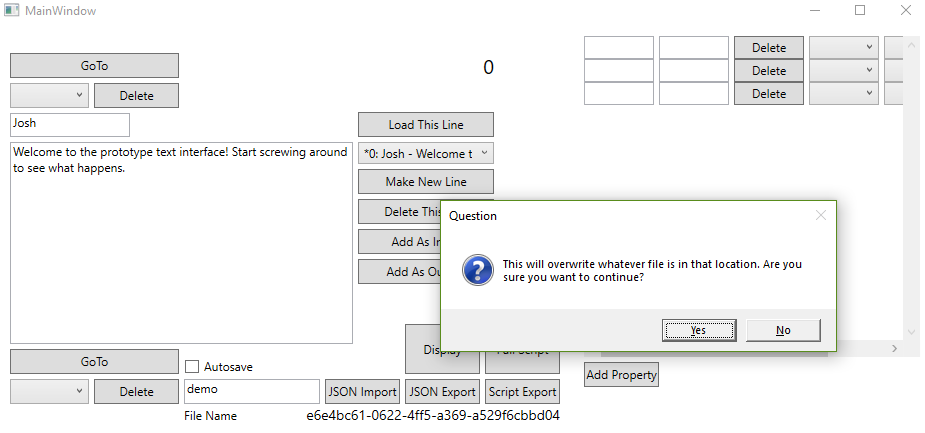
Finally, I've started to dip my toes into "stage directions." I've designed them as a sort of data-agnostic way to store information about a given line in the context of the rest of the game. Here, the user can store anything else about the scene (besides speaker and dialogue) - animation states, line deliveries, sound effects, whatever is necessary for the user's purposes. I think this is a big stride in the way of true game agnosticism that gives full data-driven rein to the user.
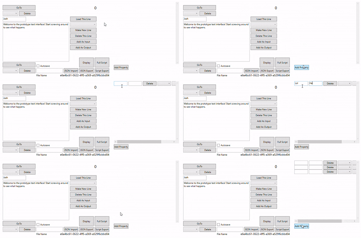
Moving forward, I think it will be helpful to embed more information about these stage directions in the conversation writer, such as type. I could have a separate input stage direction list - i.e., right now, the philosophy is that the stage directions will describe and dictate what happens on a given line that could be read as requirements on the implementation side, but perhaps I want another set of stage directions to describe requirements that must be true for the line to be viable. I'm not sure if this is too strong a diversion from my desired design or too strict a requirement on the user. Alternatively, I could spend more time cleaning up the user interface or reworking the underlying data to further divorce it from the specifics of the display. This would be really nice for porting this backend to something like a web application. Lastly, I could focus more on scale. We can edit conversations write now, but how about accessing scenes, acts, or entire plays, in a manner of speaking?
I'll receive further guidance on this later this week. For now, I'm pretty happy with where I've taken this. But what's truly going to put it over the top?
June 23, 2019
Check it out, it's the less interesting update!
I have a status update with the rest of the programming class tomorrow morning, so my main objective this week was lining that up. I created a very basic game in Unity, one that could parse in my exported JSON data and display it as a conversation that the player could walk through. It felt old and familiar, not unlike some of the work we did on Koibito. With the benefit of hindsight, it was easier to write the JSON parser in Unity the second time - and do a cleaner job of it. The game itself isn't much to look at, but it's more to demonstrate the practicality of the tool than to be creatively inspired. I’ve rehearsed the presentation a few times over now, and I feel pretty confident in what I have to show.
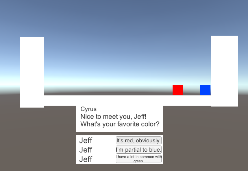
Another goal this week was cleaning up my garbage code – deleting unused variables, revising algorithms, and ensuring that I’m doing my best with the quality of the tool’s architecture. Rather than blindly hacking away, I did my research on what they proper design patterns were for this sort of tool. My system right now is most similar to MVVM – the Vertex and Edge classes make up the Models, the WPF interfaces are the Views, and the Conversation class itself is the View Model. I migrated some properties to other classes and fixed up some references in order to better adhere to this pattern. It’ll probably save me some headaches later down the line. I scoured several different blog posts and StackOverflow questions looking for how to bind data across multiple windows. From what I can tell, giving each window a reference to the other window or that other window’s data is the best option. I am doing the former and that seems to be working just fine.
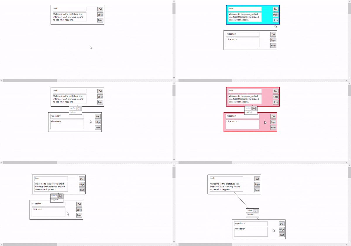
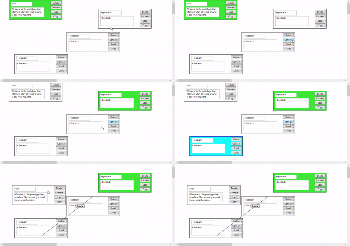
Quality of life changes were my last priority - functionality is a shallow quality if the program is not intuitive. The user can now add and remove lines and edges on the display side, with matching data reflected on the main window side. Simply right clicking empty space in the canvas will produce a new Line, and the Edge buttons can link up with each other to make new Replies. Holding shift will allow the user to select multiple lines and move them at once, and I’ve added color indicators to reflect what operation the user is in the middle of. Naturally, editing the text still works just fine, and the 2-node reply loop display bug from last week is no more - a bit ugly, but now with limited data obstruction. Actually seeing the flow of the dialogue is incredibly helpful, even at such a nascent, testing phase.
The so-called FIEA writer’s guild has still not provided the feedback I requested almost two weeks ago. Without proper feedback from the kinds of developers that would use this tool the most, I'm left simply spinning my wheels, jumping about in my development spiral, skipping evalutation and jumping right back into planning for each feature. I can hardly blame them - at this school, sometimes it feels that you could work every free minute you have and still fall behind on something. I will message them again this week and assert a firmer, immediate deadline. If that doesn't work, perhaps I can bribe them with baked goods.
The more I work on this project, the more I keep thinking of things to add to it. After accidentally deleting some nodes in a demo last week, I’ve realized Ctrl-Z and an autosave function sound pretty useful. Additionally, some replies and nodes still overlap each other – I might have to go back to the drawing board when it comes to the math for the display layout. More edge cases have come to mind, such as displaying multiple replies with the same source and destination.
For now, that all sounds like so many bells and whistles. Next week, the fun really begins with “stage directions.” I can’t wait to get cracking on it.
June 16, 2019
There are two kinds of programming projects that I work on.
There are the ones that I can't help but consider as work. I block out time to get them done, I hold myself accountable to them, and I stop thinking about them the moment I step away from the computer screen. I commit myself to them, but I keep them in a little box where I put things that don't get to rule my life.
Then there are the ones that engross me so entirely that I literally forget to eat and sleep because I'm working on them.
This project is officially in the latter category.
My primary concern this week was sprucing up the display screen. Where once there were merely edges I worked to get a WPF control to be in the direct center of its source and destination. Getting this math right was probably the hardest part of this week, translating screen space to mouse space to canvas space and all back and forth again.
Then the display layout - this was almost worse, not just positioning a single element but multiple elements, evenly spaced based on where they are and where their horizontal and vertical neighbors are. With the help of a whiteboard, a calculator, and the combined duration of four different Mountain Goats albums (Beat the Champ, Goths, In League With Dragons, and The Sunset Tree, in that order), we finally arrived at a display I was happy with. I came up with a positioning algorithm based on a recursive parentage search (i.e. what's the longest path of input edges above me?) that would determine the best place to drop the node in the display canvas. I'll still need to kick this around and try to break it before I can be 100% pleased with it.
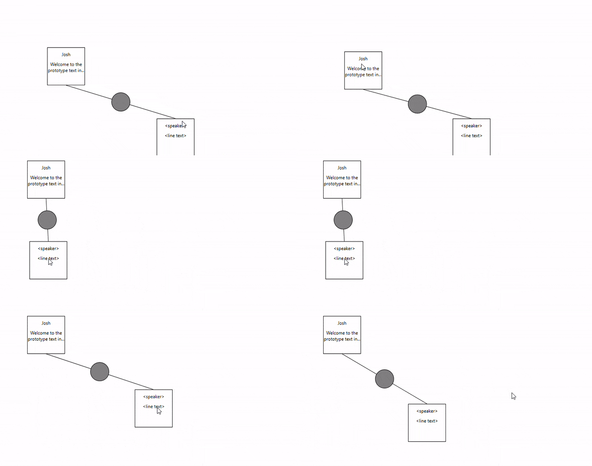
The last big task was data binding back and forth between the displays. This was a little nasty, and I'm not convinced that I'm doing it the "correct" way, but with event handlers and with each form having a reference to to the other, we can pass data back and forth whenever it changes on us. This part was especially easy thanks to the implementation of GUIDs. I assigned each line and reply a GUID on instantiation so I can easily find the frontend and backend versions of any data piece when once side changes. This was crucial to me, being able to see adjustments simultaneously and not having unsynchronized versions of the same conversation across multiple windows. Hopefully, this provides the visual guidance that was missing in my last conversation writer.
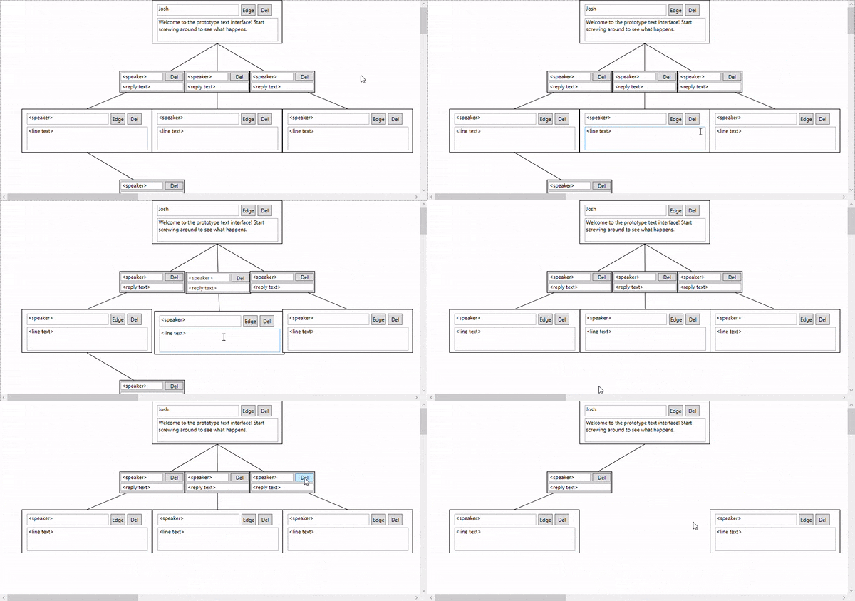
I'm extremely proud of the work I've put into this tool, but I think the time is coming to slow down a bit. In my rabid pursuit of more things you can do, I might be losing sight of things that are nice to do or easy to do. For instance, things look kinda weird in the display when there is a chain of conversations that loops back on itself. You can delete elements in the display, but adding in new ones is a much trickier challenge.
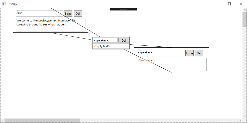
And then there are questions of design and usability. How do I represent conversations with multiple people, where the player has less agency in choosing the conversation's direction? How do I store metainformation as a "director" of the scene? When I move a line node, should it move all its children too? These are questions I wish I had given more thought to earlier in the process.
However, answers are on their way. I've sent this tool in its current form to some of the authors here at FIEA to get their feedback, and my tasks for this week are almost entirely focused on cleanup and fixes. I don't want to get to a point where I need to do a massive refactor task right at the end.
Look forward to a slightly less interesting post next week, it's going to be a lot of invisible changes.
June 9, 2019
Lots of fantastic progress this week. I'm genuinely excited about all the work I've done so far, so like all great blog posts, I'll start with the disappointment.
My original plan was to use OpenGL to display the graphics of the completed script. I could explain that I felt I was compromising the integrity of my interface and user experience by including OpenGL and that I had hence decided to drop it in favor of a more consistent interface. Perhaps I could say that OpenGL is a highly sophisticated library that would take a while to get the proper hang of, just for a fancy display. Maybe a more believable turn of events is that the OpenGL is simply overkill for just displaying basic graphs. However, the true answer is that SharpGL, the library I was using to integrate WPF with OpenGL, was not cooperating with Visual Studio 2019. In fact, I couldn't find any OpenGL library to behave with WPF. I'm disappointed to keep changing gears like this, but I think that's just part of the progression of a project - little compromises in the beginning to avoid complete failure later on. Besides, this process was much less painless.

I started with just getting the click and drag working with WPF. That was easy enough, once I made specific controls for the dialogue bits themselves. Significantly more difficult was the reply system. I realized what a challenge it would be to dynamically draw and update lines on the canvas, but I managed to work something out with LineSegments that I picked up in a WPF tutorial. I'll probably need to refactor a bit later down the line to implement the reply text displays. Live updates still yet to go as well - two-way adjustments between display and editor. Lastly, there's the math behind the display. Automatically sizing margins and placing objects will definitely be a pain in the neck. Overall, while I'm very happy with the display interface in its current state, there is a great deal left to do. The display interface is crucial to the conveyance of flow and the author's understanding of the text as a whole.
With that in mind, I've made some crucial adjustments to the editor interface. You'll now get warnings on dangling replies (those without a source or destination) and the overall flow of navigation has been cleaned up quite a bit. ComboBoxes now automatically load in sources and destinations. I've also dabbled in the .JSON exports, which is mostly stolen code from my own projects, just spruced up a bit.
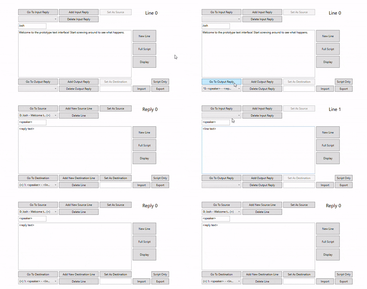
But the grand prize for this week goes to the updated script interface. Gone is the awkward stilted reply tabbing and the strange text wrapping. Now, once you have a completed script, you can jump through the script as though it were a choose-your-own-adventure game. You can even hop backwards and try new paths. This was added at the recommendation of my advisor, and I think it might just contribute more to the flow and understanding of the dialogue than the graphical display.
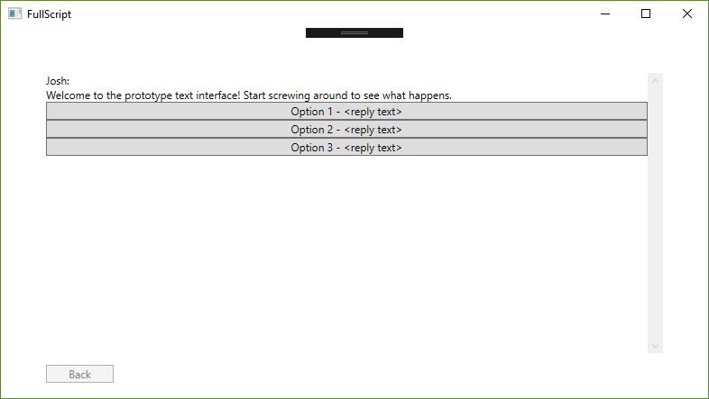
I'm still a bit ahead on my original schedule. What remains for this coming week are getting my first feedback session lined up. I want to put this game into the hands of other developers and see how intuitive it really is. From there, the really interesting stuff - director's interface and the like - will kick in. For now, though, I'll be cleaning up my interfaces and making sure the writer is ready for the main event.
June 2, 2019
After much research and personal experience/headaches, I regret to report that Winforms are sort of terrible. My first warning sign was that the only download I could find for a C++/CLI project format was entirely in German. Things only got worse later down the line when I spent several hours trying to figure out how to link text in the Winform to strings in my code. Documentation was so scattered and tutorials so out of date, even StackOverflow failed me. So before I could even fully figure out button input with Winforms, I made the same choice that apparently most Windows users have already made and migrated to WPF.
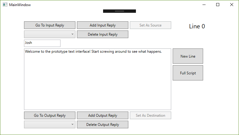
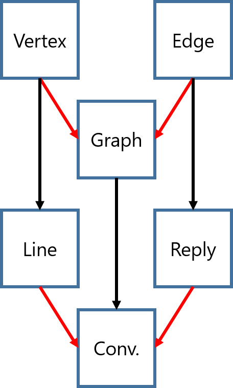
Things started going a lot more smoothly after that transition - I was able to focus a lot more on the quality of my code rather than the particulars of getting displays to behave themselves. I was able to fairly easily translate my C++ classes (Vertex and Edge, as well as their respective derivatives, Line and Reply) to C# fairly easily. I've decided to cut the Graph class entirely and move the implementation directly to a Conversation class. This is mostly due to the particulars of how C# handles inheritances and wanting to avoid casting whenever possible. If Conversation derives from Graph, then it will store Vertices and Edges, not Lines and Replies. I remember I ran into this issue when I was still working at I-CON Systems but I cannot for the life of me remember the exact name of this particular inheritance issue.
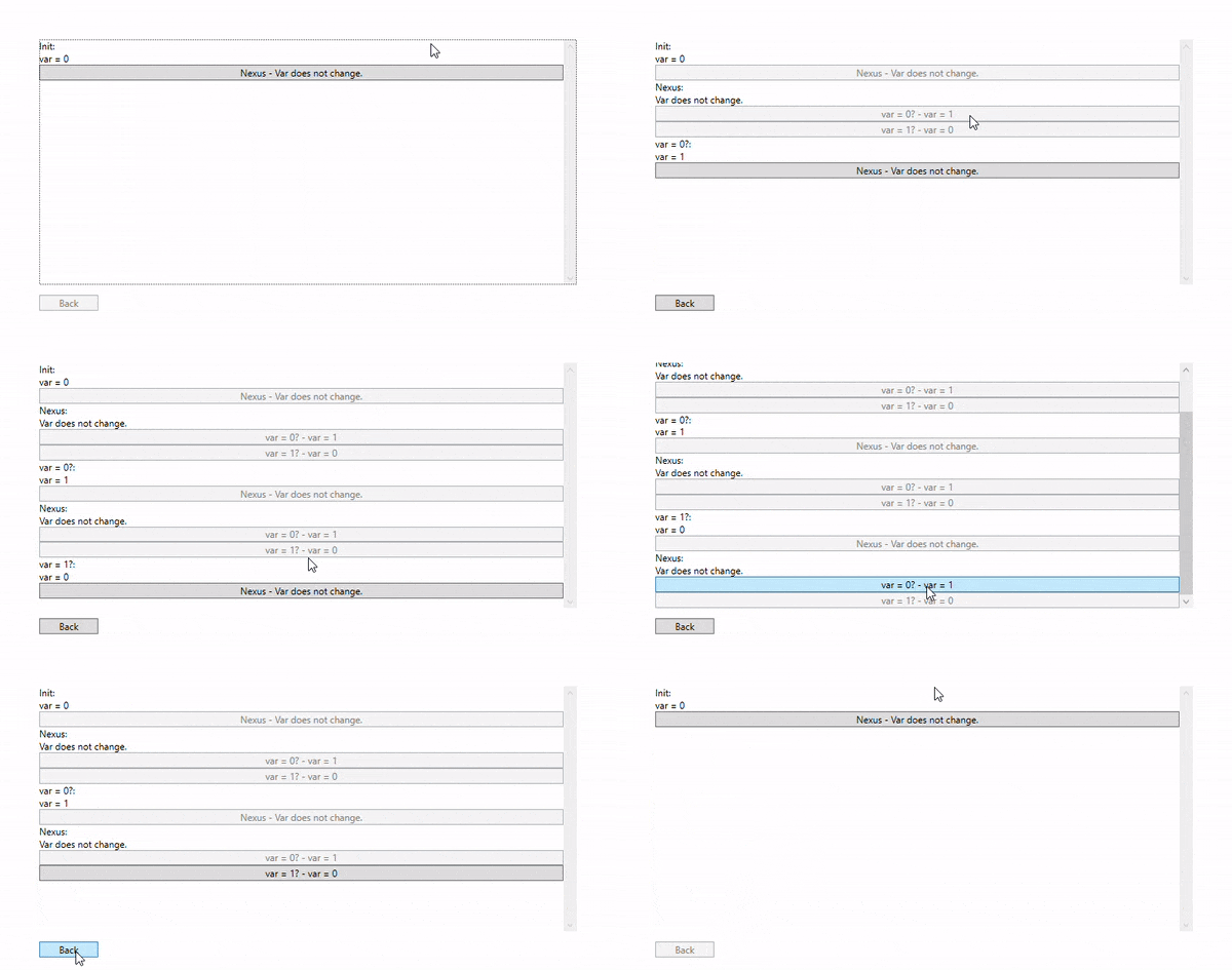
The overflow of hours I had on trying to get Winforms to behave was more than made up for in the WPF segment of my work. Implementing INotifyPropertyChanged and using the Binding property was like slipping into an old, comfortable jacket. I was able to knock out many tasks in a fraction of the time I had predicted they would take. It gave me enough time to prototype the full script interface, shown below.
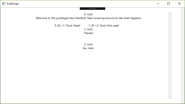
One of my biggest frustrations with the Koibito Dialogue Editor is how much it just felt like data entry. I wasn't writing a script, I was working away in a tiny Excel-like window. I think the script view, after more iteration, will offer a view that authors and writers will be more familiar with. Perhaps they could work even more effectively if they were able to edit, not just view, their writings in script form. Something for the dev test, methinks.
I'll be digging more into the GUI side of things this week. Being able to see the graphical flow of the text and really grapple with the flow of interaction is the entire goal of this project. I can't wait to get cracking on it.
May 26, 2019
And so the project begins in earnest. This week, I developed the underlying structure of the conversation system. The project is in C++, so I'm limited in how much I can just bring over information from the previous C# dialogue project. I relish the opportunity, however. There's something calming and assuring about clean slates.
However, they can also bring their own baggage of apprehension and caution, especially in such fundamental phases of the project. Knowing that the things you do now will either save you from or cause you headaches in a month's time can be paralyzing at best. Of course, one learns to soldier on anyway and simply try to trust their instincts.
The structure right now is fairly simple - a Vertex class with a vector of pointers to its edges, an Edge class with pointers to its source and destination vertices, and a Graph class with arrays of both. I'll be using the functions in the Graph class to make sure these pointers get assigned correctly, keeping only the more fundamental functions in each of the other classes (i.e. AddNewEdge(Edge*), SetDestinationVertex(Vertex*), and so on). Attaching things like dialogue text, speaker names,and other such information I found to be too complex for just the base structures of conversation. I will add those in as derived classes of Edge and Vertex so I don't couple my graph system too tightly to the concept of conversations.
The worse part about completing underlying structures like this is knowing that the easiest stuff is all behind you. After this comes the fun stuff: making the graphical interface, the authoring interface, and the no-doubt goofy particulars of working with OpenGL.
Once more unto the breach. Check back on the 2nd to see me complain about rich text input forms.
May 19, 2019
The summer semester is in swing and we've immediately hit the ground running. Programming assignments, capstone hours, even the theatre work I'm doing on the side have already filled the remaining empty gaps in my calendar. It fills my gut with a hesitant panic and harrowing memories of all-nighters from previous years. But I've grown a lot in recent months, and at least for now, I'm confident I can sidestep the self-destructive traps and negative thinking that held me back before.
I'm not here to wax poetically about my previous struggles and declare this some defining point in the history about my life, the moral at the end of a fable. This page for now is dedicated to tracking my personal programming project, a requirement for third semester programmers here at FIEA.
There are a lot of intimidating project ideas out there. Previous cohorts have done volumetric lighting, liquid simulations, complicated shaders, it's easy to feel dwarfed in terms of the skills and talents on display with these projects. My idea seems significantly more humble - a more sophisticated games dialogue writer, along the lines of Chat Mapper or Twine. I've had the most fun in grad school making tools - a JSON writer for my final project in Programming 2, a physics toggling system for PRISOM, a less flexible dialogue writer for Koibito - and I'm mostly excited to pursue this tool as an extension of that.
There are, of course, voices of dissent, mostly from within. Compared to something like deterministic physics simulation or dynamic crowd algorithms it almost seems quaint to develop what a cynic would call a typewriter with pictures. The negative voice in my heart calls it a toy, some sly admission that I lack the knowledge or ability to develop something truly impressive. So I'm doing what I learned to do with that voice in therapy - ignore it completely and work hard anyway. I'll save my negativity for the presentations this week, a far better sieve of quality than my own preemptive self-doubt.
I'll be updating this blog every Sunday with followups on my work. If you find it even vaguely interesting to see me whine about how hard programming is, tune in and stick around.